During our User Interface & Experience Design minor we have worked on a project for Dutch digital agency CLEVER°FRANKE. Nowadays, food is the talk of the town. We all want to be healthy and fit and consume the right foods to do so. Especially in today’s world of social media and the world wide web where we have access to all kinds of information, food and trying to eat healthy is becoming a big trend. The goal of this project was to design an application that gives context to the food we consume and helps the user with personalized data.
The main challenges of this project were that the solution had to be set in the future and we therefore had to make a lot of assumptions regarding actual data and that we did not had any design problems to tackle or target audiences to work with. By doing research, we had to find out what directions were interesting. Because food is a broad subject, we did a lot of research to the food market in general. We conducted an external analysis to find out more about current food trends and spoke to a number of professionals in different relations to the field of food to gain valuable insights.
During our research phase we found three different problems that sounded interesting to all of us. We came up with an interesting persona and concept for every problem and together with CLEVER°FRANKE we made a decision for which concept to develop.
We did a lot of research to find the biggest problems within the current food market. After conducting an external analysis and speaking with dietitians, food experts, bloggers and chefs, we found three interesting problems to tackle.
After the research phase, we came up with three different concepts, every concept focussing on one of the three problems that we found. We came up with three different users and to meet their needs we did some user interviews as well.
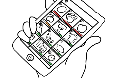
YourlossThis is an app that helps students throw away less leftovers by telling them when certain products are almost expired and by showing them what they can do with those products. We chose students as the target audience, because single households (including students) are known for wasting the most food
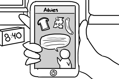
BrainyThis is an app that can help students perform better in certain situations, for example when they have a test, by telling them when and what to eat to get the right amount of energy for that particular performance. We chose students as the target audience, because 41% of Dutch students want to eat more healthy but do not know how.
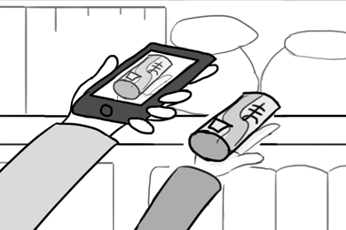
AlertgicThis is an app that lets you see when a product, dish or area contains nuts or particles of nuts with the help of AR. The app shows a colored spot over the part containing nuts. This is especially interesting for those with a (pea)nut allergy, because they could die when eating a product or going into an area that contains (particles of) nuts.
Together with CLEVER°FRANKE we decided to go for Brainy. CLEVER°FRANKE encouraged us to go for more users different from students, because that way you can see how the app will work for different kinds of users. We also decided to change the name of the concept to Nutric, because we thought Brainy sounded a bit childish.
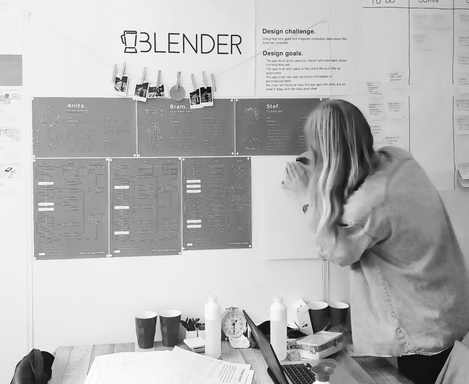
We held a brainstorm session to find the perfect users for Nutric and came up with the diskjockey, the avid sportsman and the young mother. These users sounded interesting to us, because they all have a full-time job and a very busy schedule next to that job. We created user personas to get to know them better. Meet Anita, Bram and Stef!

Anita is a young mother who works full time. She is in need of more energy, more time for herself and more help with what meals to make.

Bram is a fanatic baseball player and runner. He also has a full-time job. Bram is in need of more energy and more time to eat healthy.

Stef is a well-known DJ and travels the world for his work. He is in need of more time for himself and a more regular eating pattern.
Because it is easier to develop an app for just one user and extend for other target groups in a later stage than the other way around, we decided to focus Nutric on Bram, the avid sportsman.
Because we wanted to get our minds on the same wavelength, we started creating sketches of the app and the flow of the app first before going into the phase of wireframing. This way we could go through many iterations within a short amount of time. The moment we were all content with the sketches we made, we started creating wireframes.
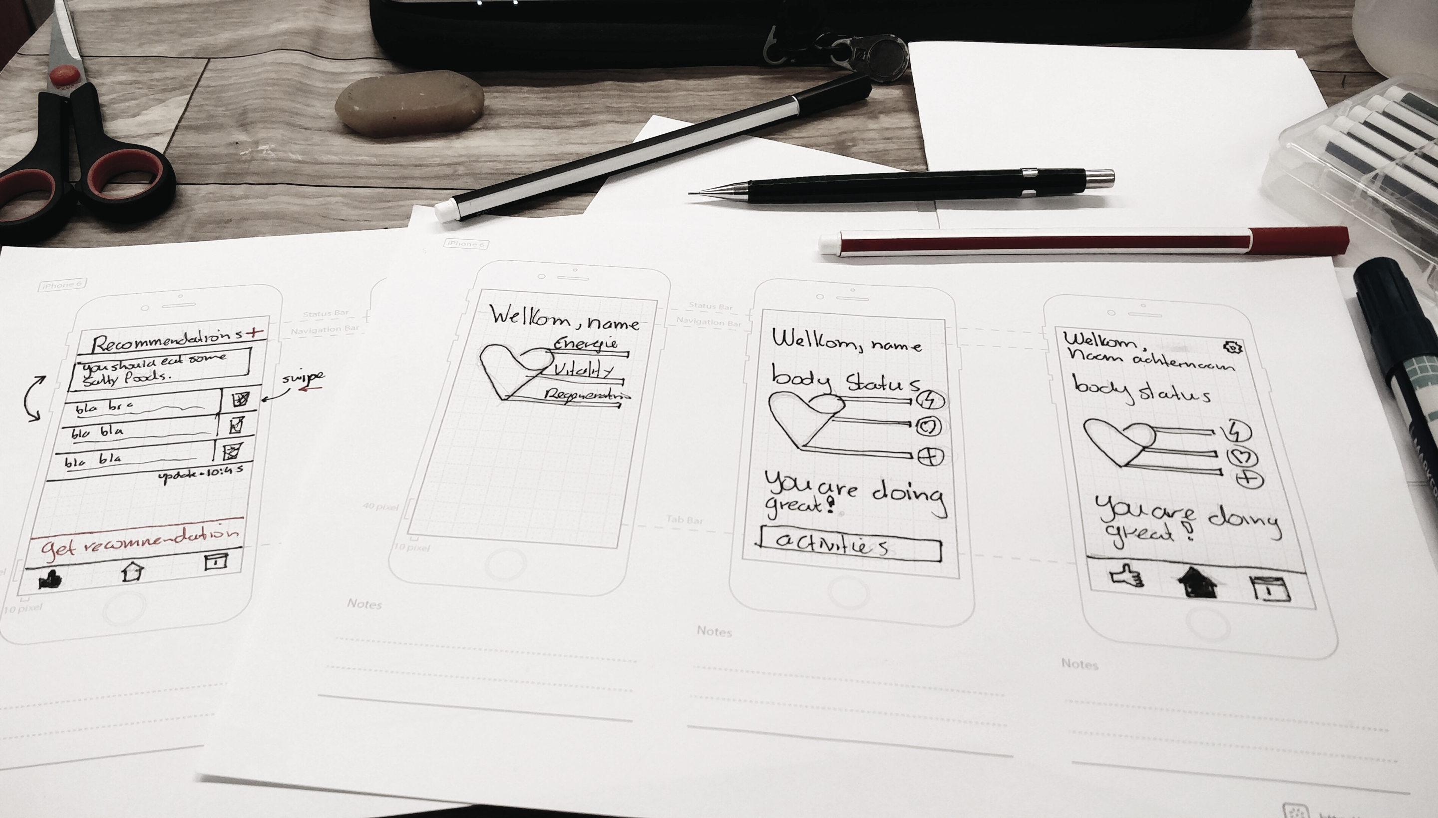
Throughout the whole process, we worked with different users and therefore with different styles for the app. Dark and light, gradient or no gradient, formal or informal, we tried it all. We tested these different styles with users to check what style spoke to them the most.
Nutric is actually a health app and that is why we chose a heart as our logo icon. Because just a heart is a bit cliche we combined it with the infinity sign, meaning that the app is constantly checking your body’s state. We chose a clean, sans-serif font for the name, because this fitted well with the icon.

We wanted the app to really focus on the data and therefore we chose only one font to use within the app. To distinguish the different font elements from eachother, we chose two different font styles. We chose Lato as our font, because we think this is a good fit with the overall design of the app.
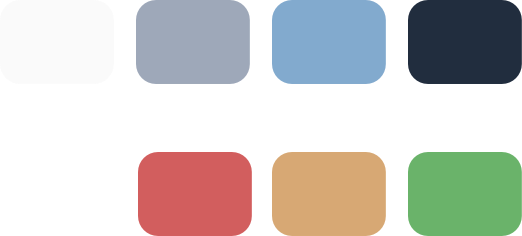
We chose blue as the main color of the app, because this color is used in more health apps and is known for building trust. We combined different styles, dark and light, to complement the data but to also be user friendly. We chose tints of red, orange and green to make sure the user knows when something is right or wrong.
No one in our team was familiar with creating data visualizations. We therefore experimented with a lot of different styles for the data visualizations within the app and tested all of them with users to check if they understood them. The goal was to make a visual that instantly tells how the user is doing, even when the user lacks the knowledge about nutrients.
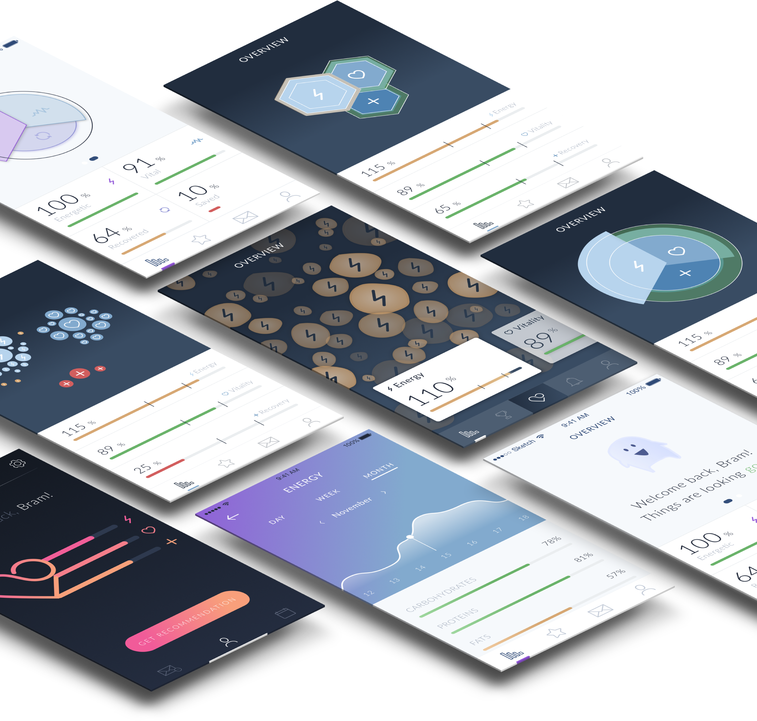
Ofcourse we had to show our concept to the users and stakeholders, therefore we had to develop a prototype. Because we had a lot of coding expertise we first tought of creating a native or web-based application. Due time concerns we finally decided to create a prototype using framer. Framers supports sketch assets and animations. This will make our prototype look slick. Framer can be programmed using Foffeescript, this looks a lot like javascript but shorter.
Users were an important part throughout our journey towards making Nutric. We felt that building an app that works with data visualizations is quite hard to understand for some users. To make sure Nutric delivers the promise to the end-user, we decided to excessively test the main features of our application. This means we did frequent user tests to make sure everything is interpreted as planned and works flawlessly.
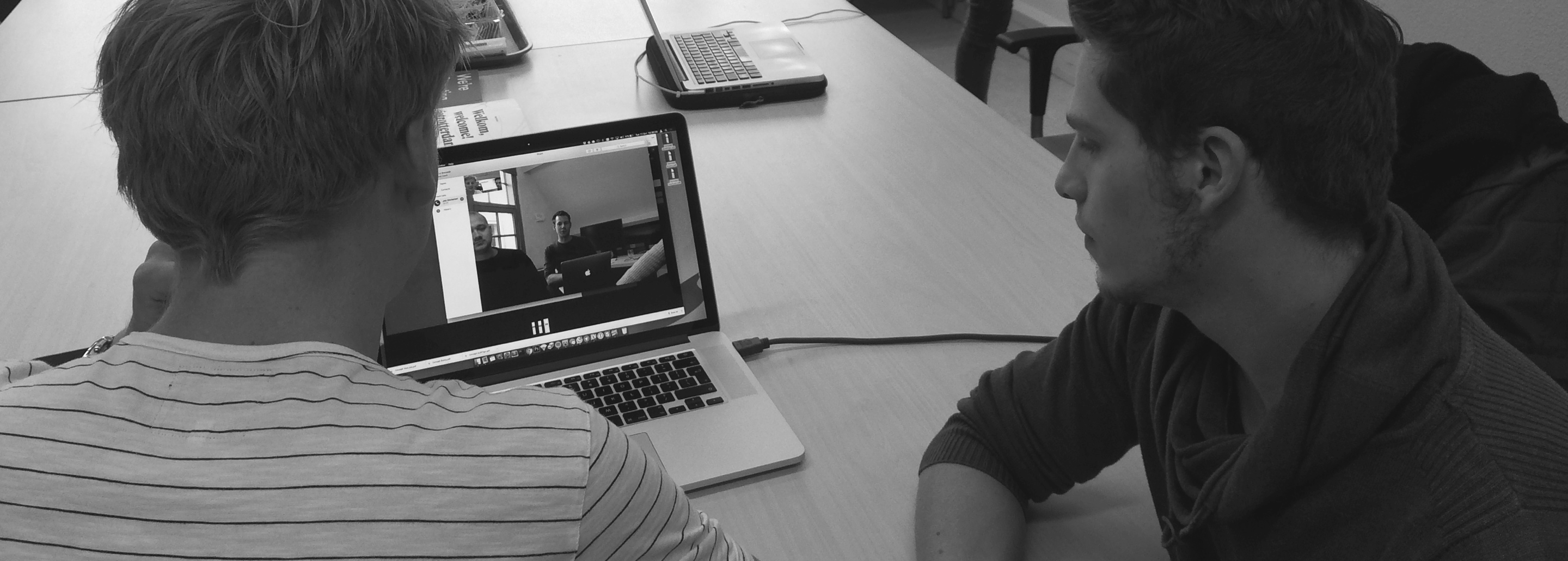
During the design process, there were a lot of challenges and struggles. With the team individual, the stakeholders and the design challenge in general. Even though we overcame these problems and created a result to be proud of. In our opinion these struggles helped us to create this end result!
Let us introduce you to the end result of our minor: Nutric!

Nutric is a mobile application that helps you to get the most out of your day. Nutric focusses on the personal performance of the user. It is basically everything you need to perform at your best.
To come across trustworthy, we wanted to give the app a personal approach. With a walk through after downloading, the app explains how he can really help you as a user. While signing in, the app does not ask for much but still in a personal way to gain the user’s trust.
Nutric is focused on providing the user with detailed, easy to understand data about their physical condition. The app does this by showing the user a data visualization containing of human cells that tell you how you are doing. Are there too much bad cells? Then you have way to much of a certain nutrition in your blood. Are there too little cells? This way the app tells you that you need more of a specific nutrition.
This group of nutrients provides the body with the energy it needs to perform. The group consists of carbo-hydrates, fats and proteins.
This group of nutrients are necessary to maintain your body’s vital functions. The group consists of vitamins and minerals.
This group of nutrients is responsible for creating new and replacing old cells. This group consists of minerals, water and proteins.
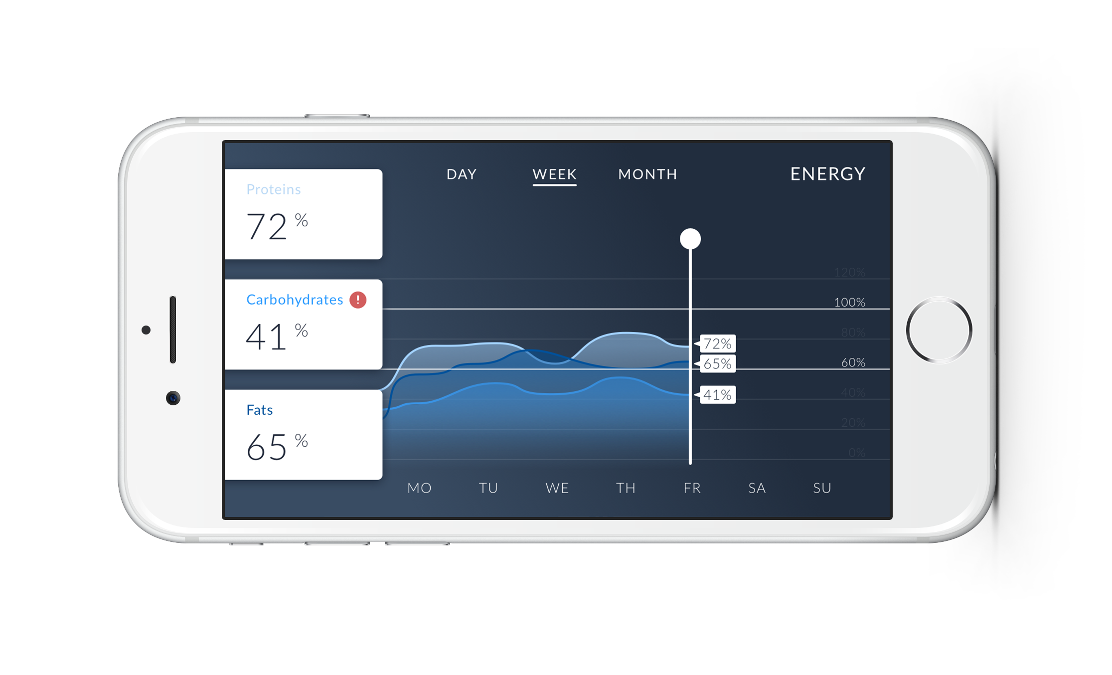
From the overview screen, the user can navigate to a more detailed screen to check which nutrient levels are low. Here the user can also see what his levels were a day, week or month ago by switching through the different states within the graph. If the user wants to see only his proteins graph, he can switch off the other graphs by clicking on the proteins bar. This way the user can get a more detailed insight in just one particular nutrient.
To get a better insight in the different graphs, the user can tilt the detailed overview screen.
The main target of Nutric is providing the user information to perform at certain moments. Therefore, Nutric needs to know when you wish to perform. Nutric gives the user the opportunity to set their own goals. Because not every goal has the same intensity or the same load on your body, you are able to set parameters to get more specific recommendations.
Hey Bram, I see you need more vitamin C before this results in sickness
Nutric is aimed to provide the user with feedback to perform at their best. It takes time to adjust to the exact needs of the user. The information provided is based on the user’s goals, body and preferences. The user needs to be notified when something has to be done. Therefore, there are different types of notifications the user can get. These notifications are value, goal or location based. The notifications will be listed in the recommendations section.
 value based
When the user has not enough nutrients of a specific type, Nutric has to notify the user to make sure he eats the right things to keep the nutrient levels high enough. These notifications make sure that the user is in a good condition throughout the day.
 goal based
When the user adds a goal to Nutric, the app will give the user goal-related recommendations. This gives the app a more personal approach, because every user has different goals. By doing this, the user can choose on what goals he wants to focus.
 location based
When the user allows Nutric to use location data, the app will be able to give location based recommendations. At your work you might not have the catering that provides all the foods you might need. But during a midday walk you might pass a convenient store. This is an example when Nutric will remind you to get something that might be a hassle later that day.

The middle button of the menu enables the user to ask Nutric for a recommendation at all times. Nutric will check the current nutrient levels and upcoming goals and decides what the best recommendation for the user is at that moment.


Because Nutric uses real-time monitoring, the app can see at all times when the user needs less or more nutrients. This way, Nutric makes sure the user feels vital and energetic throughout the whole day and also does not get sick.

By setting up goals, the user can decide for himself on what goals he wants to focus and for what activities he needs to put down a top performance.

Because some users might be allergic to foods, do not take on some nutrients or are vegan or vegetarian, the user must be able to set up preferences to make sure the app does not recommend foods that the user cannot or will not eat. mus.
We decided to focus Nutric on just the avid sportsman, but like we mentioned before, the app is extensible for more users. There are many users just like the avid sportsman and the young mother and diskjockey that we wanted to focus on at first as well that might benefit from using an app like Nutric.
When people get older, they need different nutrients in a different amounth to stay healthy. Nutric can help these people by providing them with recommendations with the nutrients they need! This will give them the energy they need to live trough their day. Nutric can also recommend food types that are easier to digest.
Diabetic people need to watch their blood-sugars really carefully. This makes it tougher to live a normal life. Nutric can help these people to time the sugar intake with their activities to provide a perfect balance. And give them an specialized diet to make sure never get in the dangerzone.
The obesity have (in most cases) medical conditions that cause tham to hold on to too much fats. The problem is that most obese people have no clue until it is too late. Nutric can help those people to recommend the right foods, and have a lower limit on the fats.
The main challenges of this project were that the solution had to be set in the future and we therefore had to make a lot of assumptions regarding actual data and that we did not had any design problems to tackle or target audiences to work with. By doing research, we had to find out what directions were interesting. Because food is a broad subject, we did a lot of research to the food market in general. We conducted an external analysis to find out more about current food trends and spoke to a number of professionals in different relations to the field of food to gain valuable insights.
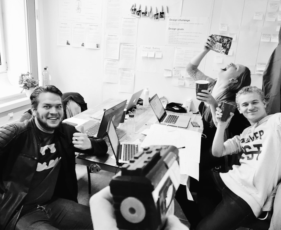
We are team Blender: a blend of Multimedia Design and Media technology students, vegans and meat-eaters, tech and design, woman and men, Venus and Mars. Now brought together to create a digital interactive product